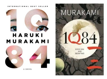
Judge a book by its cover: we all do it. After Ben from Dead End Follies posted about the French edition of 1Q84 and how it's "one of the ugliest pieces of lazy design" we started to discuss cover design on Twitter and the differences between, what Ben called, the "eccentric" US covers and what I believed to the the more "artistic" UK covers. It got me thinking whether or not UK covers were actually more aesthetically pleasing than the US covers, or if we just want what we don't have.
I decided to do a little comparison of US and UK cover art, choosing five new releases that each had a distinctly different cover design and were selected from the article in which the The Millions detailed their most anticipated books for the second half of the year, with a focus of those released in September and October, to help me decide if the UK are really better or if I just want what I can't have. The US editions will be pictured on the left, UK editions on the right.
This little experiment is just for fun and is by no means something I consider to be a grand comparison of book covers. It's only five books, people. With that being said, let's get to it.
First: Murakami's 1Q84
Verdict: I typically veer away from cover art that features photographs of sorts. There is something about it that makes it feel mass-market. I've always preferred more artistic cover art; that of the painting and drawing variety. So, for my sheer prejudice against covers with photographs, I learn more toward the UK cover art. I also identify more with the feeling the UK edition evokes with its errie full moon and dark tree branches, than I do with a young girl staring at me through a set of numbers and letters.
One point to the UK
Second: Chad Harbach's The Art of Fielding
Verdict: I should confess that I own the US edition of this book, so I may be partial, but I prefer the UK edition (thereby perhaps proving we want what we don't have). I like that the UK edition is three dimentional and it focuses more on the school aspect of the book rather than the subject of baseball. Of course, this makes sense becuse the UK doesn't have baseball, so there is no reason to market toward baseball fans, but as a woman who doesn't follow much baseball much, I do prefer the emphasis of the chalk board, portraying a university feel. With that being said, I do know this book was mainly marketed toward men, so I may be the odd woman out on this one.
One point to the UK.
Third: The Forgotten Waltz by
Verdict: At first glance, I am more drawn to the US edition pictured on the left than I am with the landscape the UK edition features, which reminds me of a trade paperback from the 80's. The US edition makes me wonder why those two chairs are empty and what exactly this woman is looking at through the window. Overall, it interests me more.
One point to the US.
Fourth: Cango's Beads and Two-Tone Shoes by William Kennedy
Verdict: First I'd like to mention what an interesting title this one has. If I just saw the spine of this book shelved somewhere and read the title, I'd pick it up to read more. With that said, I prefer the UK cover art to the US. The US cover art doesn't really catch my eye and if it did, I would pass it by for something else. The UK edition is a little more upbeat and draws me in more than the first.
One point to the UK.
Fifth: I Married You for Happiness by Lily Tuck
Verdict: Not suprisingly at this point, I've got to lean toward the UK edition. I like the block letters that are centered on the cover and the image of a man in a button down cardigan holding someones hand. Though the US cover is intriguing, I would opt for the UK edition if I had the choice.
One point to the UK.
Final Tally:
UK - 4, US - 1
Those Brits can rock a cover design.


